| Entrance | Mainstreet | Wiki | Register |
|
# of watchers: 38
| D20: 2 |
| Wiki-page rating |  Stumble! Stumble! |
| Informative: | 0 |
| Artistic: | 0 |
| Funny-rating: | 0 |
| Friendly: | 0 |


| Main Street - News - Main Street Poll - Daily Poem - Featured Story - Featured Art - Featured Member - Featured Wiki | Your House -profile -diary/blog/jo -guestbook -poll -statistics | Messages -Wheeee! x new messages! -inbox -outbox - view unread messages | Notes - Friend list? - the list of wikis you're watching/ownin - List of houses you're watching - List of forums you'rer a member of (should take you to the page where you can edit forum prios, etc.) - possibly a link to help page? | Forums - Forum replies - list of forums - more stuff... need to think more about this part. | Wiki - Index - Wiki Help - Community (community index page) - Competitions? (maybe would go somewhere else better?) |
 [Triola]
2011-07-02 [Artsieladie]: As far as the layout for Elftown, I think the default style as it is now should remain pretty much the same, but more consolidated and better organised by offering drop-down menus to reduce the need for all the many buttons, similar to: "Suggestion for top nav and what should appear in drop-down menu:". As far as the default colours, the traditional greens, should remain, particularly the ivy. The greens currently used are easy on the eyes AND they give Elftown a warm, inviting atmosphere. Making Elftown's colours like Deviantart or Elfwood as two examples, would remove this and replace the current atmosphere with that which is impersonal, cold, and too much like any other site on the 'Net. But offering alternatives "as choices", lets each member choose how they want to be on Elftown, atmospheric wise.
Elftown is a lot more than just a website to post your art, writing, and what-have-you. It's a community as well, and being such, it should retain the warm atmosphere. If Elftown is made into being, looking, and working just like all the other sites, it will then become just like all the rest. It's uniqueness is part of what makes Elftown special.
However, to reiterate, members should still be able to choose other styles, as they presently can, because of "different strokes for different folks" as they say.
Dark backgrounds are very difficult to read for people with poor vision like myself. Elfwood, for one example, is impossible for me to read, unless I use my cursor to highlight the entire text on any given page.
The "Whee, new messages!" and the "Whee! Someone has written in your guestbook!" are just so Elftown and really should remain. These are just such a 'special' part of Elftown.
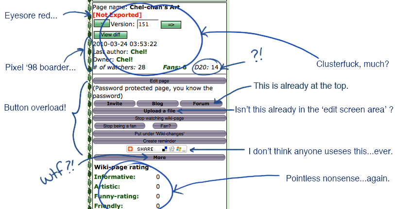
As far as the box that Chel points out: I agree it could be better organised, but just because some may not use some of the information and features made available, it doesn't mean that others do not. Therefore, some of the info/features may be or seem pointless to some, but not to all. For instance: I "do" use the Share button; I "do" use the Stumble button; I "do" look at and note the rating information; the "D20 + #" is a "roll of the die" which I have also made use of; the "eyesore red" is to bring attention to the fact that the page in "not exported" and if one doesn't want to see it, then they will export the page, otherwise it remains red. It has gotten my attention many times for pages that were supposed to 'be' exported and weren't; the "more" button I have used countless times. The point is, perhaps 'some' don't use certain information provided, but what about those that do?
However, perhaps an "expandable box" could be the answer, something similar to how the "Upload a new file" works. This way, those that don't use certain info, don't need to ever see it, but yet those that do, can still easily access the info.
As far as the column on the right and in my case it is a VERY looooong column, perhaps, some of the sections could be made into 'expandable' boxes as well. I say "expandable boxes" because expanding a box doesn't flip the whole page, as does "hiding the status".
So I think that just because some may not use a feature or the information provided, this does not mean that "all" do not. Expandable and therefore collapsible boxes would appease both that do and those that don't.
Also, redesigning this site, is not going to help with the inner workings of Elftown. Just doing a revamping and expecting such to automagically make everything wonderful is like pouring perfume on something that smells bad and expecting everything to be all smelling good again. This site could use some better organisation and some consolidation with its layout. I don't dispute this, but not so much that Elftown becomes no longer Elftown. But... Elftown also needs improvements 'internally'. Otherwise, simply changing its appearance will make no difference.
The Council/Crew wants more respect and I believe they do deserve more respect, but I also believe the community of regular members need to have more of a say than they do currently, which is practically zilch. I think both sectors would have more respect for each other, if both sides worked together in having a say in how this site, this community, is run. As it stands right now, only a select few, whom are chosen by a select few, have all the say and make all the decisions "behind closed doors". There is no representation whatsoever from or for the greater sector, but yet, it is the greater sector of this community that will ultimately make or break this community. ...And from the looks of things, Elftown just continues its downhill slide.
2011-07-02 [windowframe]: "There is no representation whatsoever from or for the greater sector,"
We had the assembly and it just died, despite several crew members trying to revive it. Apparently the community just weren't interested in it. Also: I dispute this. There's representation from the non-crew in the literature Judges, EGG, Tutorials & Lessons, Chat, The Herald, etc.
"Also, redesigning this site, is not going to help with the inner workings of Elftown."
The inner workings of Elftown are getting reworked. They get reworked all the time. It's the graphic part that's lagging way, way, waaaaaay behind the times. No one is going to care what our inner workings are like if they get turned away by a butt-ugly '95 site. <_<
2011-07-02 [Artsieladie]: Perhaps because the Assembly wasn't ever made as important as the Council is? Or perhaps, in a different wording, the Council overshadowed the Assembly? The Council has always been in the spotlight, but the Assembly never seemed to get the same amount of recognition and/or acknowledgment
There may be representation in certain functions or programs, but there is no representation where things get decided upon in regards to the whole community that I'm aware of. The Crew discusses and decides everything behind closed doors and then when the Crew has decided upon whatever, it is then presented TO the community, not for the community to also have their say, but presented already as 'how it is to be'.
If the inner workings are getting worked, then perhaps the whole community could be kept abreast as to exactly how it is? I will say, however, by placing this wiki-page and the ERA page in the news was a great move on the part of the Crew. This is a step in the right direction.
...And actually, SilverFire, I have noticed the efforts that you and the Crew are making in trying to make Elftown better. But if the general community can be included more, I think both the Crew and the general community will be more united as a result and will also respect each other more as a result. The more general members that can be incorporated, the more interest and help the Crew will have and therefore, benefit from as well. ..And the Crew will be more and much better received by the community of which they reside over.
When people feel more important, they are more inclined to be supportive and to become involved and participate. If community involvement and participation isn't once again ignited, no amount of graphic designing is going to change this, because a major necessity needed here is drawing people here, but an even bigger, more important factor necessary is, keeping them here.
I think there needs to be a major, major campaign launched to bring more people here, but also a major "heads-togethe
As far as the design, I do agree that this site could use some better organising and consolidation in regards to the layout, graphics, and whatnot, but I do not find the current general lay-out to be "ugly". The current lay-out IS Elftown. Making it work and look like all the other sites on the web, is then no longer going to afford our community the ability to stand "out" from the rest and would make Elftown "just like" all the rest. Therefore the only thing that would make Elftown still be Elftown, would be "in name only". All of its unique charm would be lost, and so, there would also go all of its magic.
I think that Elftown can be made better organised and so forth, without taking away from the traditional Elftown altogether. Consolidation is needed some in the design, but it is also needed in regards to the management of this community as well. There is and there must be unity in community, if that "community" is going to not just survive, but thrive.
Unfortunately, however, many people that were once here as active members and that did care are long gone. Therefore, with the ones that still remain, we need to encourage these individuals as much as possible to help bring members back and to invite new members in. This site has become stale and stagnant, not because or through any fault of the Crew or the general community really. It just has and things need to be refreshed, but not as much with the layout as with new ideas, new concepts, new works, which comes from people, not decoration. Decor can spark, but what will keep the embers burning after the novelty wears off? Novelties almost always, if not always, wear off, and when this happens, what then?
Elftown will have been on the map for 10 years as of 2012-02-07. I think bringing out projects and contests to honour this event could help to instill "Elftown Spirit". If this could spread across the community, it may help to boost the morale here, which is needed throughout the entire community.
I'm sure the Crew would appreciate more participation in projects and contests they've put a lot of time into, wouldn't they? It's disheartening to put time and effort into something, only to have it not given any attention, especially when the something has been created for those that are mostly paying it no mind! The general community needs to realise what's put into making contests and whatnot possible.
I've been on both sides of the fence, of which there really should BE no fence, but still, and I can see valid points from both angles. The community does need to support the crew, but the crew needs to also trust that the greater sector needs to have some more say, too. Then "everyone" will be more inclined to feel like they matter here... EVERYONE!
2011-07-02 [iippo]: What you say is really good, and important to be thought about, but can we use this page to mainly discuss the graphic outlook, the redesign, please? Your points about how ET should look are getting lost in the long comments. :)
2011-07-02 [windowframe]: (But specific ideas for non-graphic redesigns are welcome on ERA).
2011-07-02 [Stephen]: o_o'
Huge wall of text.. *falls over*
2011-07-02 [windowframe]: 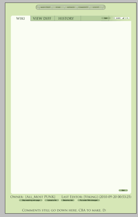
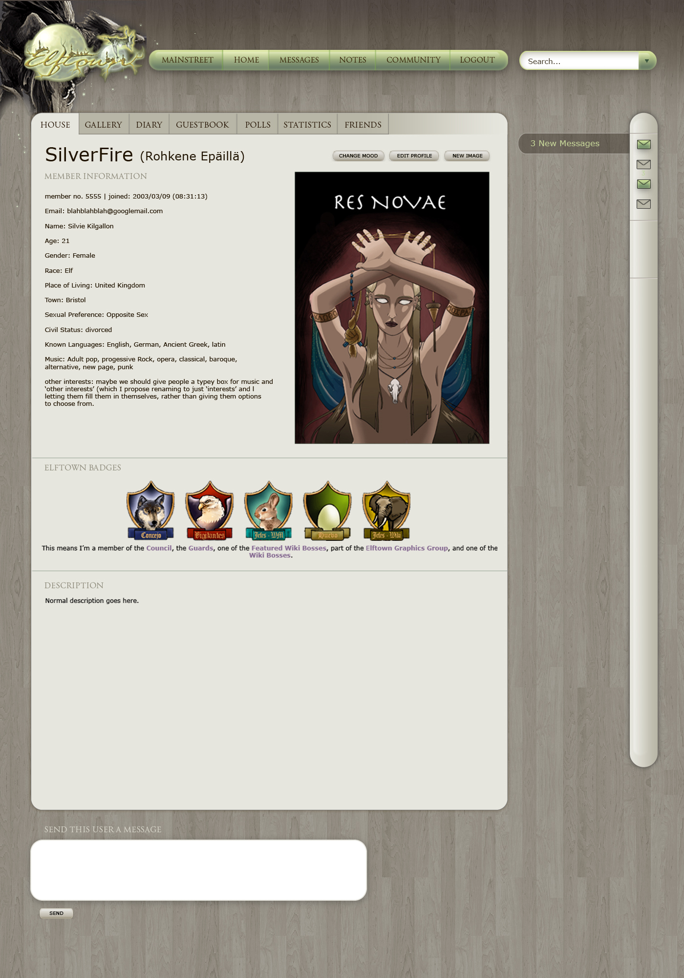
New potential colour scheme: slightly closer to some of the shades of green we have now, and with a paler background for the text area. Crappy quality due to me just taking a screen cap and uploading that instead of saving it properly. That's also why there's grey frame around the edge, so just ignore that. <_<
2011-07-02 [Madhalf Heatlump]: The concepts SilverFire has up are wonderful! Simple is a wonderful thing when you consider websites that are jam packed with so much shit you get lost.
2011-07-02 [Stephen]: I like that outlook, Silvie. Color is nice too.
2011-07-02 [Chel.]: Ooo... pretty green. :3
However I think the saturation should be adjusted... or a change in the text. It's not as quick of a read as I think it should be.
2011-07-03 [Karithina]: I love that colour scheme! A lot of my problems with the other layouts have been that the colours are changed so drastically that you can no longer really feel/see the original website (the sort of grey-green one looks very dA I think?) - but your latest concept with the same sort of pale greens looks friendly and familiar :)
A fine compromise~
2011-07-03 [Paul Doyle]: I'll second the greenness. Making this site grey like so many other sites (EP and DeviantArt coming immediately to mind, along with that cheesy dA ripoff-style used on Elfwood for a few years, further sticking the fork into EW)sucks. At the same time, the graphics absolutely need to be updated.
I know Art Deco is so 1930's, but I've always loved that style and know it can be used in modern times. Though "Star Wars, Episode II: Attack of the Clones" frankly wasn't that good, remember that cool opening scene, where Padme's Art Deco-inspired Naboo cruiser is headed to the Coruscant landing pad, where some very futuristic Art Deco-inspired skyscrapers are poking out of the fog? Anyway, maybe Art Deco clashes with ET's overall "look", but just a thought looking outside the box . . . ET probably wants to be immediately recognizable without being outlandishly gaudy.
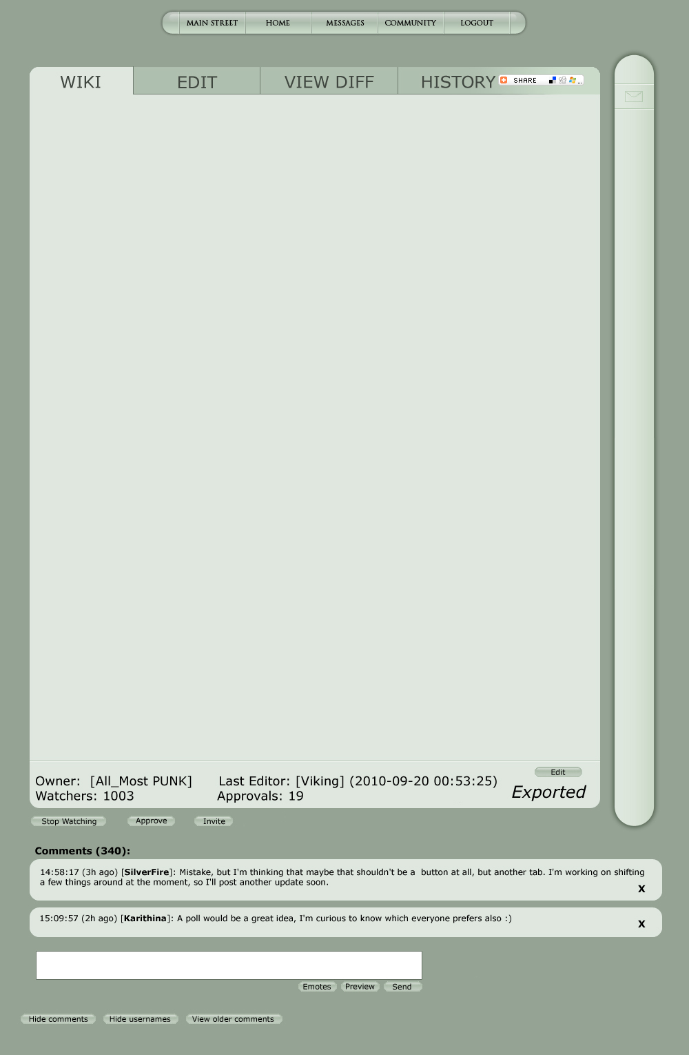
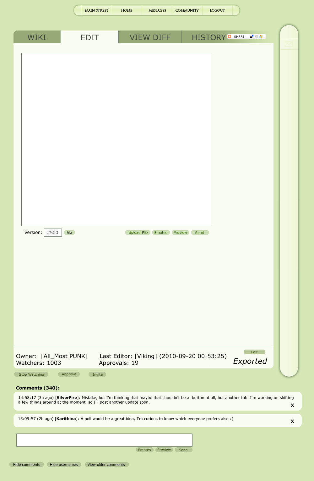
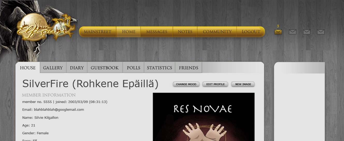
2011-07-03 [Triola]: Very pretty! But does the edit button go on top of that line like that, or is that just a mistake?
2011-07-03 [windowframe]: Mistake, but I'm thinking that maybe that shouldn't be a button at all, but another tab. I'm working on shifting a few things around at the moment, so I'll post another update soon.
Maybe we should do a poll with the two (or more, if someone wants to suggest some) colour schemes to see which people would prefer.
2011-07-03 [Karithina]: A poll would be a great idea, I'm curious to know which everyone prefers also :)
2011-07-03 [Artsieladie]: I understand [iippo] and [windowframe]. ERA seems to be pretty much along the same lines as here though. *thinking*
Umm... where exactly are these that are currently in the right hand column which is available on every page, supposed to be:
- Mainstreet alerts (News, Daily Poem, etc.), Online Friends, Member changes, New diaries, New images, Wiki invitations, Change and comments, Wiki-changes, Wiki-comments, Poll-comments, Bookmarks (on every page), Elftown status, Last logins, Interesting people?
I'm having difficulty reading many of the examples given.
2011-07-03 [windowframe]: All bar last logins and Interesting people would be in the thin right nav bar. Icons would be coloured when you had changes/messag
2011-07-03 [Artsieladie]: Would such pop-out boxes be able to handle 100-200 or more links each?
Also, would the "viewable" version of a wiki-page have to fit within a designated area only?
2011-07-03 [windowframe]: I don't see why not.
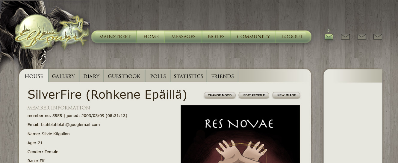
2011-07-03 [Nioniel]: I like the colours, Silvie. :)
2011-07-03 [windowframe]: @ Nio: Thanks. :)
@ Artsie: "
Also, would the "viewable" version of a wiki-page have to fit within a designated area only?"
Sorry, I don't get what you mean. X_x
2011-07-04 [Artsieladie]: As the wiki-page is now, one can put content anywhere in the light green area above the comments and to the right of the ivy border. But it appears to me, that this will no longer be the case with your display image. It appears as though all the content will have to be in a designated area, which I outline in this image with a red outline:
http://elftown
Also, where did the "approve" and "approvals" come from? Are wiki-pages going to have to be approved now or something?
2011-07-04 [windowframe]: Yes, it will have to be within "set parameters" but only in the same way it is now. It can't go off the edge of the screen. The box will still shrink and grow to fit bigger content. Content now has to be in a designated area too, it just doesn't have visible edges.
No, it's just a different name for 'fan' which got suggested in the forum. I liked it, but then, I would, because I don't really care for the word 'fan' at all. I can't think of any wikis that I'm genuinely actually fanatical about. <_<
2011-07-04 [Artsieladie]: So those buttons: "Wiki" - "Edit" - "View Diff" - "History" are all going to be across the top of every wiki-page when it is viewed? I don't much care for the "visible edges" idea.
The word "approval" makes it sound too much like: "If the page is 'approved', then it is a good page or a page of quality", but "If the page is 'not approved', then it must be crap. This site is supposed to be a place to enjoy. The word "approve" gives an air of being "too serious", whereas the word "fan" is less serious and more along the lines of a fun thing to do, to become a fan. ..And the word "approval" or "approve" would make Elftown seem too much like Epilogue, the snobbish site.
2011-07-04 [windowframe]: To me, the 'approval' is a fun thing. It's a fairly common comment-thing at the moment amongst some circles anyway - I've got lots of comments on some of my wikis from people writing "*approves*" But it's never once made me think 'oh gosh, I'm so glad people think this is a wiki of quality!' or 'Oh noes! No one approves! This must be crap." Whereas at the moment I really dislike and mostly avoid the 'fan' button due to the 'fanatic' associations it brings to mind for me. Fanatic is a really negative thing to me. It's also a bit too face-booky for my taste - as is 'like'.
I've never used or even seen Epilogue. <_< I guess I'll go look at it now.
The edit tab would be there, yes - in place of the edit button in the side bar now. I'm not sure about having separate history and view diff tabs, I'm thinking they could be combined into one, but again, it's just really a relocation of the current button which is always there. They also don't have to be quite as big as they are now.
2011-07-04 [Artsieladie]: Well, this is how you perceive the word, and I can probably assume there are others as well, but there is still a huge difference between the meaning and usage of the word, "approval" and the word, "fan". Approval is something that is sought after and serious in nature, can carry considerable weight; fancy not so much and is on the 'light' side. Perhaps, you don't perceive approval as being anything more than fun, but many will not perceive this word the same as you, especially because of its definition alone.
Approve:
v.
1) To regard as worthy, proper, or right.
2) To confirm formally or authoritativel
v.i.
3) To show or state approval: often with of.
Fan2:
n.
Informal An enthusiastic devotee or admirer of a sport, diversion, celebrity, etc..
I'm assuming the page versions will be under the "history" tab? Where's the "D20" going to be?
2011-07-04 [windowframe]: This is personal preference. I appreciate you weighing in that your personal preference is different to mine, but I don't think it's going to be helpful to discuss much further just between the two of us. We need to know what other people think. :)
I'm not sure about the D20. I'd like to know how many people actually use it. Which would help decide where to place it, if at all.
2011-07-04 [Veltzeh]: I need the D20, but rarely. Also, the couple of last times when I needed it, I couldn't find it because it isn't visible on the logged in version of the wiki. Now I know that the exported version has it.
2011-07-04 [Veltzeh]: Aaand now I realise it's the stylesheet's fault it's not visible. Damnit! >_<
2011-07-04 [windowframe]: When/how do you use it? Is it something you need just when editing, or is it useful that everyone can see what D20 was generated for each page version?
2011-07-04 [Karithina]: Perhaps if the button used "Fancy" for before you've "Fanned" a page instead of only when it is asking you if you'd like to "Stop Fancy" (to continue with a nice thing it it already half doing)? A some other popular websites use words/images such as "Like", "Love", "Heart" and "Thumb" for publicly displaying 'approval' of a page, so of course I won't suggest any of those... but "Fancy" sort of keeps with their same theme while sounding less modern, and so fitting in more with Elftown's fantasy feel? If it were to say "Fancy This" it would even take away the problem (if it /is/ a problem) of people misreading to to mean "This page is fancy". (I'm just trying to find a compromise :#O)
2011-07-04 [windowframe]: Maybe we should go pirate, and the button should just say 'YARRR!' :P
2011-07-04 [Karithina]: Actually.. going for Originality, Fantasy-Themed and Simple - it works better with my formula than it should. I think a 'YARRR!' button should be seriously considered xD
2011-07-04 [Paul Doyle]: YARRRR! Methinks I should third that, matey!
2011-07-05 [Artsieladie]: Pirate speak is okay on occasion. I even had my Facebook set for 'pirate speak' for a little while and it was amusing and fun for a little while, but that's all... a little while for a change of pace.
The D20 is the equivalent of someone rolling dice. Every time you refresh the same page or go to a different one, the number comes up a new number that can be the same or a different number, just as with the same odds if you had just rolled dice.
2011-07-05 [Stephen]: /votes yes for a YARRRR button
/goes back to lurking
2011-07-05 [windowframe]: I know what the D20 is (hell, I even have some real ones myself <_<). I know why it was initially added. I just don't know who is using it now, and what for. Though here it doesn't change when you refresh or visit a page, but only when you submit a new edit.
2011-07-05 [Veltzeh]: I use the D20 when I need a verifiable roll (which is pretty rare, though) and sometimes just for something random.
I don't care for like-buttons.
2011-07-05 [Artsieladie]: Thanks. I meant "edit" the same page or go to a different one and edit that one. I had 'refresh' on the brain at the time. :P
2011-07-06 [Paul Doyle]: I see there's still some folks who believe that to redesign ET would be equivalent to killing ET. This is a comment of mine from another wiki, but I thought I'd share most of it here, in case the comment is mysteriously deleted on the other page ;-)
"ET has to be brought into the 21st Century, but not at the expense of its still-beating heart and soul. I do like the green, yet I dislike all the antiquated, clunky shit that's forbidding to the Internet newbie (like my wife, who I'm trying to convince joining ET since she sometimes visits exported wikis). When I joined this website in June 2003 I was in fact an Internet newbie, having delayed getting my first PC for a good ten years. ET was absolutely bewildering to me then, and it doesn't have a fraction as much clutter and crap that it now has (and none of those horrible ads, but that's a whole new can of worms right there).
I say we short-circuit the silly drama, put aside our differences and work together on well-known pages like redesigning et and era. If we want more quality Elftowners we have to cut the bullshit already, even if the bullshit starts and ends with us. Otherwise this website is going to continue languishing, and all the wonderful work the current crew is trying to accomplish, with our help (the community) is going to be all for naught."
2011-07-06 [Artsieladie]: No, Paul, your comment will not be deleted. It's your opinion and you have the right to your opinion just as everyone else does, BUT... differing opinions and/or approaches should not be labeled as "silly drama". The only way differences can be ironed out is to clarify first what these differences are and then see how they can be merged into "one doable plan of action". SilverFire has already cleared up 'some' cloudy areas for me and this wouldn't have happened if I hadn't stated how or what I see in all of this.
2011-07-06 [windowframe]: The Main Street Poll usually gets changed on a Friday (excepting today, where [Hedda] was testing for a bug), so I was thinking we could do the poll about what to call the fan button then - so if you have any more suggestions as to what that button should be called, make them before then! :3
2011-07-06 [Veltzeh]: My suggestion is "I really don't care." X)
2011-07-06 [Stephen]: lol @ Yarp
Interesting word. xP
2011-07-06 [Stephen]: Oh, I'm sure someone's mentioned this, but things like the Elftown Academy links should probably be removed from Mainstreet (since it's not even used anymore) and I don't think anyone uses the Elftown Card Service, or Worldgen, there's an Invite button/link on both your house and Mainstreet; you probably only need one of them and many of the other links in that group can probably be relocated to the box above the calendar (I know it's able to be changed by anyone with priv 89, but that's probably a good thing if pages get moved/changed/
2011-07-06 [windowframe]: Have you not seen Hot Fuzz? :P
Yeah, there are a lot of links at the top of Main Street that need replacing or (re)moving.
2011-07-06 [Stephen]: Newp. No idea what it is.
Mainstreet needs an overhaul. 
2011-07-07 [Chel.]: I think it would be nice if the "calender" stream on the left was either a drop down menu of some kind or on a different page than the Mainstreet.
I also think the donators featurette in the center should be adjusted/moved to a better location. Still on the front page, but just not THERE. News and important things should start there IMHO.
2011-07-07 [windowframe]: I agree, about everything. I actually think a separate calendar page might bring it more attention - I barely notice it with everything else on Main Street.
2011-07-07 [Chel.]: Aww.. I'm glad you agree Silvie. :3
2011-07-07 [Stephen]: I don't think hiding it in a dropdown would do it much good, but something like relocating it, or at the least doing something to make it stand out more would be a good idea. Right now, it's so huge I don't remember the last time I actually bothered to read it. xD;
2011-07-07 [windowframe]: Well the idea for the top nav is hovering over a button produces a drop down, so even if people just go to click on 'Main Street' in the top nav, the calendar option would be visible.
2011-07-07 [Stephen]: So you'd click on the calendar from the dropdown and be taken to the calendar page? Something like how poll.html (Mainstreet Poll) is on its own page?
2011-07-07 [windowframe]: Yarr. Then the calendar could be laid out better, too – more like how actual calendars work now, with... multiple columns. :D
2011-07-08 [Chel.]: *nod nod*
2011-07-08 [windowframe]: We could also possibly combine it with the 'annual events' thing at the bottom of Main Street, too.
2011-07-08 [Stephen]: _>
Does anyone even use that thing?
2011-07-08 [Chel.]: I can say that I have not.. personally.
2011-07-08 [iippo]: I am fond of the annual events, though more work could be put into it, definitely (like, it'd be much more interesting if ETers made a wiki about the event that is relevant to them, rather than just have wikipedia links). But combining it with the calendar on a separate page would be cool, I think. :3
2011-07-15 [windowframe]: It *is* how normal calendars work, after all. :P
2011-07-18 [windowframe]: I did wonder if we could turn turn the wiki-rating system into something more userled, too. As in, Each user can give their vote to a wiki as informative, artistic, etc. You wouldn't be able to down-vote, but perhaps be able to remove the vote you had given. It's open to potential abuse in that friends will just click all buttons on their friends' wikis, but that hasn't really happened in other places where I've seen something similar implemented, but then, I tend to see it implemented in forums so that you can vote on individual posts. Being able to vote on wikis might encourage more nepotistic voting than forum posts/comments do.
2011-07-18 [Flisky]: And more wikis would get rated that way, instead of just certain ones.
2011-07-18 [Paul Doyle]: Wiki-rating access is currently limited to only certain people, and this can (unintentionall
2011-07-18 [Paul Doyle]: (If people are malicious troublemakers abusing this feature for whatever reason, they could have their access removed prior to a banning.)
2011-07-18 [iippo]: Currently it's a priv-thing for the purposes mostly expressed by Silvie's concern. It's not meant to be clique-ey and everyone is allowed to ask to have their wikis rated.
The voting thing might work, kind of like in Ye olde writersco where you could give a number-rating to a text...
2011-07-18 [windowframe]: Since you still wouldn't be able to down-vote wikis, it would be pretty part to abuse the feature maliciously, it would just be a cliquey 'my-friend-mad
2011-07-19 [iippo]: Huh? Wouldn't voting 1 would be kind of like a down-vote?
2011-07-19 [windowframe]: Oh. XD Apparently I didn't explain very well. Everyone would get one vote of one. So if a wiki had a friendly rating of 25, it would be because 25 people had decided to up-vote it as friendly. So voting one would just up-vote it by one. :P If you have already voted and want to remove it, you could, but you can only take back what you put in – i.e. a vote of one. So the rating would just drop to 24.
2011-07-19 [iippo]: Ah. Well how do you feel about the system Writersco has, of ratings from 1 to 5 and it then counts the average. Although that in turn has the sadder side-effect of people are able to ruin the average for really good things by voting 1 on everything... I kind of like the positive version better >_>
2011-07-19 [windowframe]: I don't actually remember that, but I presume you mean something like the <srate> tag produces? Yeah, I agree, I'd prefer a system that only allows positive voting, else I would be worried about the malicious ratings possibility.
2011-07-19 [iippo]: Yeah I think it's the same.
2011-07-20 [Chel.]: About the +1 Google button... I think something went wrong with the coding. Seems the "Edit" button is no longer aligned with the right side of the comment box. Just an OCD design aesthetic of mine.
2011-09-28 [Tynuka-Rhytishy]: I REALLY hope this pulls through! We're trying refresh I Believe in Elftown. I'm definitely a strong supporter!
2011-10-03 [Dark Side of the Moon]: I like the proposed re-designs also. They're easy on the eyes and have lots of interesting looking tabs and features. They make everything look more organised.
2011-10-03 [Tynuka-Rhytishy]: ^^^ Agreed!
2011-10-13 [Stephen]: Hm, I really like True's revamp he was working on.
2012-01-26 [NOOOPE]: The last comment on this page was made a few months ago so...
This site looks like it's from the late 90's. Is anyone interested in seriously discussing revamping agin? This place is a fossil and if anyone is honest about getting new users and up-keeping this community, a major renovation shouldn't be something that is idly discussed and abandoned. Everyone is chanting how they love elftown. Great. Now, who the fuck has the skills the change this place and why aren't they currently taking a very dedicated whack at it?
I just don't think it's clicking how outrageously outdated this place is. There are free codes out there... free, copy-paste that could be used to completely change the site for the better. Why is nothing happening? This place looked old in 2002 folks! It cannot be taken seriously. It just can't. I don't understand why anyone who doesn't have some sort of nostalgia attached to this place would ever bother joining, let alone stick around. I joined this site in 2002. That's ten years ago.This site has made minimal changes in that time, like absolutely microscopic changes. 10 years! Do you have any idea how much the internet has changed in 10 years? Did I mention this place is a fossil? Why isn't anything happening? Exactly who do I need to shake out of a coma, I mean shiiiiiiiiiiii
And that has been a rant by [NOOOPE].
2012-01-26 [Sunrose]: I think the people here are willing, but Hedda isn't as much :P
2012-01-26 [NOOOPE]: Why? It's like he's drowning his own baby. Does he care?
2012-01-27 [Akayume]: I'm not sure. :/ But I agree with you, but I lack skill and ability to do any coding/changin
Everyone I've directed to this site says they can't figure out how to use it and that it looks ugly.
2012-01-27 [Rice]: I sadly also lack the ability to do any coding or fancy pants stuff, for I am an idiot when it comes to these things. But I am always on board for designing ET. I agree with Akay and everyone else, the website is old, old looking and has an old feel to it.... :/ *says old again*
2012-01-27 [Paul Doyle]: This inaction makes me sad. (Well, sort of sad but not weepy.)
2012-03-26 [Paul Doyle]: . . . and it still does. A graphics revamp really would be nice, and the primal shot in the arm this website really needs.
2012-03-26 [Chel.]: It's inactive because no one seems to give a shit about IMPLEMENTING these new designs to ET.
2012-03-27 [NOOOPE]: http://elliotj
It's sad, because ET isn't even Web 2.0. It's like.... Web 0.4
2012-03-27 [NOOOPE]: Ok, I take that back. It's like, 1.5 according to the design elements listed here http://en.wiki
Matter of fact: http://emarket
ET is in the green and red. That's sorta out of date. And by sorta, I mean it's seriously out of date. It's not even web 2.0 yet.
2012-03-27 [NOOOPE]: ALSO (one more note and I'll shut up) look at the 2002 altavista example: http://sixrevi
THAT IS ELFTOWN. Look at altavista 2009! Three years ago! Look how much is changed! JESUS CHRIST HEDDA I HOPE YOU WATCH THIS PAGE.
2012-03-27 [Chel.]: Shit... well I'll have to put "redesign personal website" on my list of things to do this month.
2012-03-27 [NOOOPE]: Gotta make is mobile accessible! Though, to be fair, lots of the "mobile" internet is sorta ugly in my eyes. If we could get ET to web 2.0 and get rid of bevels and gradients I would be very happy.
2012-03-27 [Chel.]: Not to mention I have no idea how to make something applicable for phones.
2012-03-27 [NOOOPE]: Your site is sexy. Don't worry about it.
2012-03-27 [Chel.]: But my thumbnails have a reflection! XD
2012-03-29 [Paul Doyle]: If this whole page really is a joke, a disclaimer would be nice. If it isn't a joke, a timetable for planned dates of implementation would be even nicer.
2012-03-29 [Chel.]: It didn't start as a joke...
While the "powers that be" continued to ignore the redesign requests presented on this page, it became a losing battle.
SOME people just don't like change(FOR THE BETTER) I guess.
2012-03-29 [NOOOPE]: The sad fact of the matter is this place WILL die if it doesn't modernize. This site performs wretchedly on mobile devices, its appearance drives new people away, and with a dwindling population of oldies who stick around for the rapidly decaying community... this place is doomed. Just completely and utterly doomed. Now, I really wish Hedda would communicate with us and tell us why he's letting this happen. It is so frustrating seeing something I've been apart of for years rot away when it could be easily saved. I would donate to this site if the money went to hiring a professional designer and placing ads on devart and other busy artistic communities.
2012-03-30 [Paul Doyle]: I agree, and even for me it's hard to stay completely cool about it. I'd hate to see this place truly die. This website helped me immensely in so many ways back in the day, and there really was a tight groovy artistic community that really seems to have gone by the wayside.
A revamped Elftown does not have to be a large website (and it did grow much too big about 5-6 years ago, much too diluted for its own good). If you have a vital core of artistic people who don't have to be from Elfwood (seriously, does anybody even care about Elfwood any more?) then this place will carry on into the future. It's sad that I chat with far more long-term ET'ers on Facebook, than I do on Elftown. What's wrong with this picture, boys and girls?
Either update this website, or give us ample notice when this place is shutting down permanently so we can recover and preserve all the stuff we did for this website over the years. No matter what, it can't go on for too much longer in its current incarnation.
2012-03-30 [Chel.]: You are going to have to convince "you know who" of all this... and we've tried.
There are many educated, graphic artists on this site that are willing to put in their time for free(including myself) and Hedda isn't taking advantage.
2012-03-30 [Paul Doyle]: Historically on this site, I'm seen as a self-righteous annoyance so I won't waste my breath since anything I do or say will most likely be ignored in public, and mocked in private in a snobbish, unsanctioned forum I've no access to.
(Specifically, that non-Council private forum that used to pop up when you made a good, detailed suggestion on the "Elftown, Suggestions" forum. Someone---usua
Anyway, I hope the right things happen before this place is beyond salvage. Not trying to make pointless drama, mind you.
2012-07-02 [Eyonic]: damn, reading this wiki i was hoping it was still active :( guess not so much eh? Onward with my search for active wikis.
2012-07-02 [windowframe]: Well, you're still welcome to contribute opinions on the redesigns above. The main slowdown is me not having (or finding/making) the time to sit down and actually turn some of these ideas into the individual elements Hedda would need to implement them. Maybe if someone harasses me enough I'll find the time to at least try to make the necessary elements for the top nav. Though I'm still not entirely sure which colour scheme to go for.
2012-07-03 [Chel.]: Didn't we have a poll vote or something about that a few months ago?
2012-07-03 [windowframe]: I remember one about what to call the fan button (<poll:77350>) but not one about colour-schemes
2012-07-03 [Chel.]: Oh no.. I remember. I think we changed ET to Kaimee's page: _kaimeetest.cs
And had a vote on if people liked the change.
2012-07-03 [Eyonic]: I would put my ideas up there, but I rather like what's already up there more o.o Also, no talent in making websites here -_- never got to take that class while I was in college.
2012-07-03 [windowframe]: Well, there are several different designs up there - which you do prefer?
2012-07-04 [iippo]: You could make greyscale semi-transpare
Or go with the light green versions, since, y'know, Elftown :3
2012-07-04 [windowframe]: I wonder if the top nav would work with that sort of semi-transpare
2012-07-04 [iippo]: Now that I look at your originals in moar detail, I realise that the buttons essentially don't have a colour, they're more of a light-ey-fying effect on the background colour. So in the wiki they are lighter green and in the house they are lighter grey, just like the bg.
So if the button graphics were a semi-transpare
2012-07-04 [windowframe]: There is a dodge layer mode, I think.
2012-07-04 [Eyonic]: I really like silverfire's design up there, especially the lack of all the clutter the top of the page. The different colors that kaimee added looks great too, would be awesome to be able to pick from more that one color o.o that green gets boring after a little while. Peoples' 'house' page would be a bit more 'simple' but a bit more customizable, which is better in my mind o.o
2012-07-05 [iippo]: "would be awesome to be able to pick from more that one color" This is doable with stylesheets, of course :) Just like you can do it now (from the "edit your house" thing). Also, Elftownstylesheets.
2012-07-05 [Nocturnaliss]: I'd like to toss this stylesheet into the fray, made by our [NOOOPE]:
_parchment.css
I've been using it ever since she made it. She was toying around with stylesheets, and I'd mentioned I'd enjoy a parchmenty one... and there it was. I still love looking at it.
I really do like Silverfire's design: it's simple and effective, and you just can't get lost in it as you can now. The only gripe I could have, and it's really just me nitpicking, is that it feels too modern for an 'Elf Town'. I'd enjoy a nice little vine somewhere, or a leaf or something... something that gives it that zest of personality and charisma that, in my eyes, Elftown has now by looking different, albeit seriously outdated (and immensely cluttered). I've personally never used the forums because I just... don't understand how they work.
2012-07-05 [iippo]: That stylesheet is a good illustration to show what you can do with stylesheets and how far you can go with it.
My suggestion now (seeing as how many people are griping about nothing being done :P) is to forget the look - for now. Realise that everything that can be done with stylesheets needs to come later. We need to get the skeleton first, and that skeleton needs to be then dressed with stylesheets, and we'll argue over the final official stylesheet then :P
So lets focus on how things should work. Where should things be. I am preeeeeeetty certain that Hedda doesn't want to boot anything that does anything. So the idea of "get rid of x" or "y is redundant" is unlikely to go down well with him, since he usually codes ET to do stuff he wants it to do. Mostly all new features have come about that way, he or someone else had an idea of "wouldn't it be cool if x". And that's how you end up with a bazillion different button designs and the place feels like a patchwork quilt.
So instead of "too much clutter, get rid of it" we could approach it as "too much clutter, think of places for it that make sense." Everything needs to work as it does now, only better and needs to make more sense intuitively for users who haven't grown up with it (no biggie, right? ;)
The top nav suggestion faff is good, drop-down menus that have grouped things in a way that makes sense. That's really good.
The next thing to worry about is the right hand side box. We have that bar in Silvie's design that has a little letter to notify of messages. It also needs to notify of forum replies, new forum postings, wiki changes, wiki comments, wikis with both changes and comments (wiki ones preferably in a way that still lets us ignore the ones we can't get to just yet...), guestbook messages, diaries, poll comments as well as all the mainstreet features (news, poem, art, poll, wiki, member... whatallelse? Unless features could be all under one button). How do you do that graphically? Is the entire bar also kind of a dropdown menu? What happens if I click on that letter? And if all the ideas about these functions could be explained as clearly as possible, preferably with visuals, we'd get far <3
TL? You must read! D:
2012-07-05 [Nocturnaliss]: Doesn't it make even the idea of redesigning ET completely moot ? If Hedda won't even consider removing things that are either useless or in the way, then there's no point whatsoever discussing a redesign - which in itself implies adding and removing things! Sorry, but that's just too discouraging.
2012-07-05 [iippo]: Politics are often discouraging, and this is kinda a lot like politics :) Communication, compromise etc... You give some and you get some. Priorities and all that jazz.
What is more important, getting rid of things that you personally don't use, or making things look easier on the eye so that people aren't frightened away by the mere sight of it all? It may not be as effective to hide things instead of throw them out, but when visitors come, the main point really is that all the junk is out of sight so you won't be embarrassed :P
Don't get me wrong, ideals are really important too. So please do also make things that show "my ideal Elftown would look like this" that will make people want to strive for that goal. :) But we also need to work with the realities, function as well as form, which is what I was trying to get you all to think about :)
Also, do notice that this is me talking, not Hedda :) I'm basing what I say from what I think Hedda is like, not what he really is like.
2012-07-05 [windowframe]: The entire bar is a... oen-sideways menu? X) The idea was if you clicked on the message button (which would light up when you had a new message) it would present you with either
a) an overview of your inbox, which would show maybe the first five new messages, and the first line of them, so you could click to read
b) various options of 'show inbox' 'read oldest/latest unread message' Maybe there could even be a 'compose message' option there? So you don't have to go to someone's house to start the message, but could just do it by typing their username in a 'send to' bar - more like email, I guess.
2012-07-05 [iippo]: Ah, oui. A bit like Facebook's except... bettar!
Would the options "drop down" to the left or the right? Or down? Or up? Or to some other dimension heretofore unknown to man?
Maybe the forum replies could do something like that too, where it wouldn't just take you to whatever posting was the first? That you could see something like "Viking replied in junk forum: " and then maybe even the thread title or such-much. "Viking replied in the thread 'Baahmoobahgoa
Guestbook can take you straight to your guestbook, probably. Also, it would be lovely if the guestbook button doesn't disappear after you click it. Easy access to own guestbook has often been on my wishlist.
2012-07-05 [windowframe]: They'd come out to the left side of the bar.
2012-07-31 [Aeolynn]: Man... I wish Elftown looked modern :(
2012-07-31 [windowframe]: If anyone has a bit of spare time on their hands and access to photoshop, there are actually some ways in which you could help. The redesign of the top nav bar is the goal at the moment, and for that to be implemented, it needs to be broken down into specific graphic elements. I have the files containing the image of the nav bar and it's ddms, I just don't have the time to sit down and break it up into the necessary pieces.
2012-08-03 [Nocturnaliss]: I could help you with that if you want... as long as you don't expect it done by next week or so << XD
2012-08-04 [windowframe]: Well, I definitely won't be able to do anything until at least the end of September, and I have no idea if I'll have time even after that, so you'll still be faster than me, I suspect. I'll try and upload the stuff you need and explain better what needs to be done at some point this evening. :)
2012-08-08 [Nocturnaliss]: Don't worry, there's no hurry ;) work's still gonna be killing until end of the vacation, then I've got two weeks off coming up. ... so, yes, I might be faster than you XD
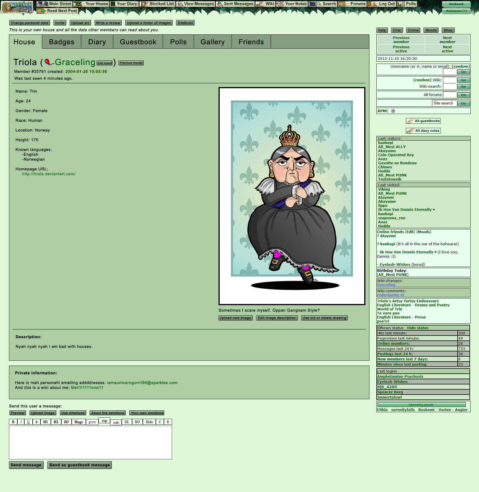
2012-11-09 [windowframe]: So here's a simpler update to the House page, working more with what ET already looks like:
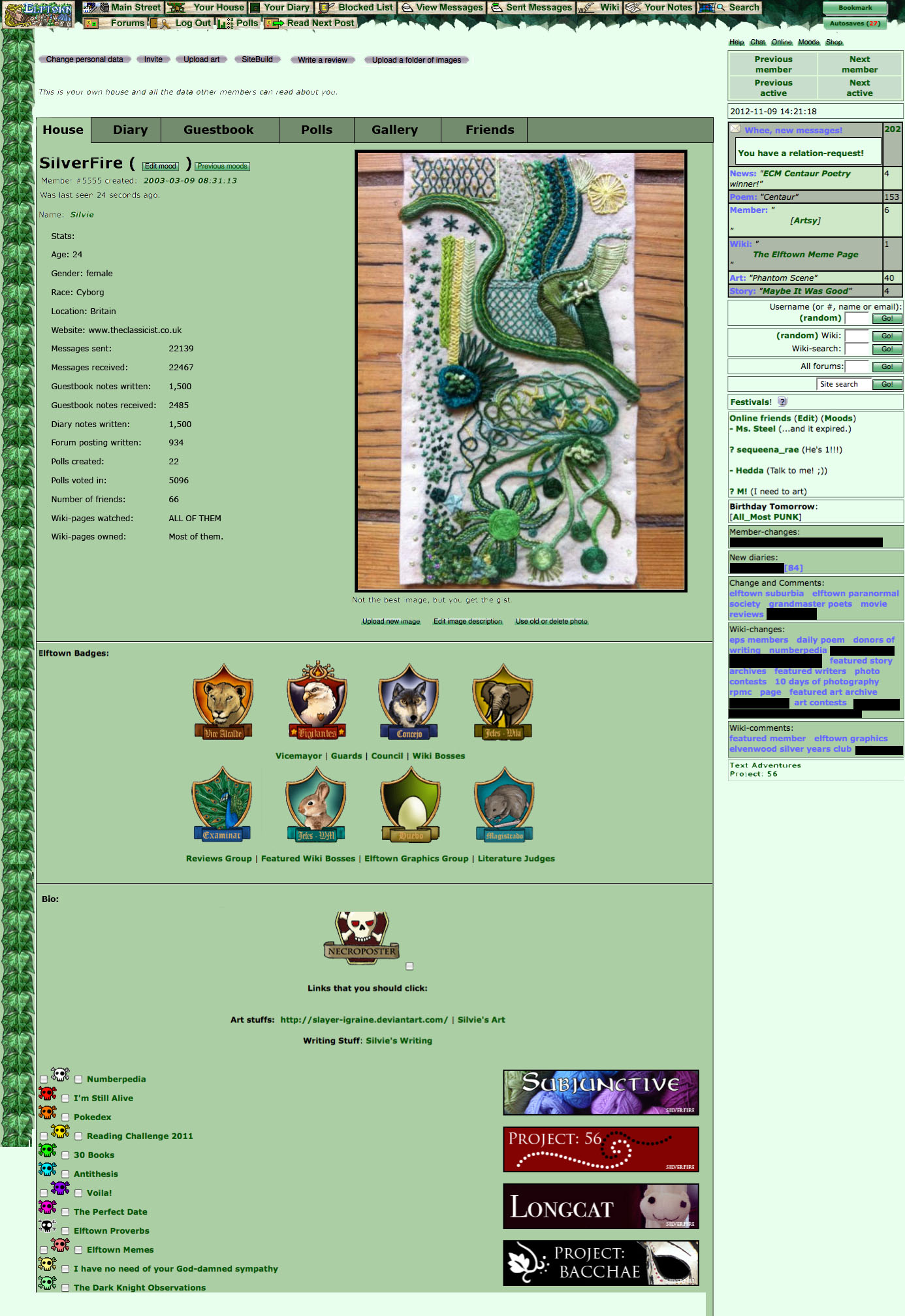
2012-11-09 [NOOOPE]: Oh God, I am so happy I figured out style sheets. I do NOT miss the leaves and green. Oi. I like that set up though. Now, if we could reduce the button orgy up top into a few drop down menues. Also, as awesome a that toggle set up is, I'm not a fan of the stats. They don't really say anything interesting and they only put more space between your bio and the top of the page. As things are, I wish the badges could move under my bio so visitors get to the meat of who I am more quickly.
2012-11-09 [Chel.]: Also- I thought it would be a good idea to make a competition for a NEW mainstreet entrance image. Something that is voted for in a poll but the crew ultimately decides so we don't get stuck with something shitty. If I could change one little thing about this website... its that damn entrance image of Hedda squatting in the bushes.
2012-11-10 [windowframe]: I know what you mean about the badges, but I think it's good for the badges that show council, guard, etc. work to be at the top, so unless we're going to have two separate badge slots - one at the top for admin badges, and one at the bottom for donor badges (which I don't think is likely) I'd argue they should stay at the top.
I'm not really too fussed about whether the statistic go there or in their own tab, it was just a suggestion. Personally, I'm more interested in that info than I am in someone's body shape, sexual preference, height, etc. And listing that info at the top seems to... suggest it's more important than it is - given that we're not a dating site. I know some people like the stats, so I figured I'd at least see what it looked like.
Re the entrance image, I'm not actually sure where the edited version came from (as in, the version with the photo of Hedda) the original image which was submitted to the contest doesn't have that. So we could maybe persuade him to at least change to that one.
2012-11-10 [Chel.]: At LEAST.
2012-11-10 [Triola]: Problem is, he won't. Because when we had several images that traded places on the entrance page, most new people joined from the entrance page with the current image, apparently, so Hedda argues it is more appealing than any other image ever will be. Personally, I suspect correlation rather than causation, but there you have it.
2012-11-10 [hanhepi]: I love your wiki stats, Silvie. XD
I also like the idea tabbing the house like that, rather than having all those buttons up there. Maybe Stats and Badges could be tabs as well, further streamlining the house area? Clutters up the tabs area though, so I dunno. For the council/guard badges being prominent, maybe have small versions next to the name, where moods go now, put the moods in smaller print below the name, like this (where b in parenthesis indicates uber important yet tiny badges):
Silvie (b) (b)
You have no mood in your image for me to use here
2012-11-10 [hanhepi]: I tried that with the h3 tag for name, and regular bold for mood, but you end an h3 and it gives you a line break. So, picture it with bigger username.
2012-11-10 [windowframe]: Oooooh. Donor badges could be tabbed. :O I even thought of that once before and then totally forgot it - there could be like a 'trophy cabinet' tab that was where all the competition badges are displayed. :3
Not sure about tiny badges, simply because they don't scale well. They're not vector images. They pixelate massively when you shrink them.
2012-11-10 [Triola]: I am way for the tabbing of donor badges! And maybe displaying them in a sort of listey, more orderly fashion? Like
Badge - wiki
Badge - wiki
Badge - wiki
Lists would be long and a hassle now that the badges are in your house, but that doesn't matter if they have their own tab :D
2012-11-10 [Triola]: That would work too :) anything but how they are now :P
2012-11-10 [Triola]: Also, going off Silvie's tab thing, imagine if we removed the leafy sidebar too and then made most of the buttons look the same!

(And nevermind the font, didn't know which one to use, so I just Arialed the shit out of it)
2012-11-10 [windowframe]: Verdana, I think, for future reference.
2012-11-10 [Triola]: Cheers :)
2012-11-10 [NOOOPE]: Just that looks a million times cleaner than et right now. I wish the green could die.
2012-11-10 [Triola]: I think we all wish the green could die. But I could live with the green if we could just get rid of some of the clutter around here and make things cleaner and more orderly >.<
2012-11-10 [iippo]: Well some folks like the green and the colour is really easy to change with stylesheets, so there can be a number of alternate stylesheets made to choose from. As long as as much as possible is done with CSS (buttons and such... I think currently it's only the top buttons that are not CSSable. Oh, and maybe some others too. Nvm :P)
2012-11-10 [Triola]: I agree. All buttons should be CSS-ed and then made much more uniform.
2012-11-11 [hanhepi]: Green can be a classy color when the right ones are used, like in Silvie's older examples. For me, reading black text on these current greens is quite nice, I can sit here all day and it doesn't strain my eyes. Black text on a white background though I can only sit and read for a few minutes before I have to squint, then about 20 minutes after that, my eyes hurt. So as long as there is a color, I would probably be fine.
As rapidly as what's popular in design changes, and as slowly as we seem to be able to make changes here, I don't think we should try to go too trendy with a redesign. Hell, at this rate by the time we get it done, this look will be back in style. XD And don't say it won't, just look at the fashion industry and look at the god awful shit from the 1980's that has come back and people are wearing.
2012-11-11 [NOOOPE]: " Hell, at this rate by the time we get it done, this look will be back in style. XD And don't say it won't, just look at the fashion industry and look at the god awful shit from the 1980's that has come back and people are wearing."
I'm gonna call you on that one. That's not how internet design works at all. It changes in response to new technology (mobile devices, updated code) and to become over all more functional. There is no way in hell things will swing back this way unless society crumbles, all information is lost and we have to rebuild from the ground up. That's just... no. Even if you're joking... no.
2012-11-11 [Triola]: Archived the two new images before they disappear in the comment history.
2012-11-12 [Chel.]: Thanks!
2012-11-12 [windowframe]: We could probably also get rid of that line explaining that "this is your house". <_< And it would be nice if all those buttons at the top could be shifted elsewhere, (the edit profile button into the profile itself, and some of the others into the top nav, maybe)
2012-11-12 [Triola]: The 'Upload art' and 'Upload folder of art' ones could naturally go somewhere underneath the 'Gallery' tab, and the 'Write a review' one maybe somewhere underneath the 'Diary' tab?
2012-11-12 [windowframe]: If there was a "contribute" option in the redesigned DDM-style top nav, then 'upload art/folder of art/review/sit
2012-11-12 [Triola]: Haha, I hear you :P
2014-09-19 [Imperator]: I'm going to try and phrase what I think the problem with ET is in the most succinct way possible: ET needs to be open-source. Why? People (read: person) are refusing to give their godly permission for anything to be done. How complex is this damn site? Couldn't this same architecture be hosted somewhere else but with a much more flexible and open contribution scheme?
2014-09-19 [Chel.]: Yes please.
2014-09-20 [Teufelsweib]: Yep
2014-09-20 [Paul Doyle]: You're preaching to the choir. But will anything be done? Obviously not.
As long as there is revenue coming in from those cheesy ads which anyone with half a brain ought to AdBlock, there is no compelling reason for someone with such emotional disconnect to his own site, to ever do anything to reboot this site minus all the avoidable bullshit that's happened on this site since around 2004 (when Elftown seemingly lost its direction and original intent, in pandering more to the "hangarounds" and trolls, than it did focusing on those of us artistic-minde
I'm still holding out from actively participating on this site until the reboot is finished, but I'm no longer holding my breath for these changes to happen.
2014-09-20 [Imperator]: Obviously this site is dead and there is nothing that will save it. I'm talking about starting a whole new site, new url, new host, new everything. Then all the frustrated people can just join the new site and we can all screw this place.
2014-09-20 [Teufelsweib]: try ask hedda if we can have a new heddate maybe under the same server, except then on that site we can adjust the coding if wanted. he can have the ads revenue for all I care, at least we could make changes at wish.
2014-09-20 [Chel.]: Good luck... people have tried asking him...doesn't work.
2014-09-20 [Teufelsweib]: yeah, I know. but if people want to get the code, that's the way to go imho
2014-09-22 [Yncke]: I don't think you need [Hedda] to open source his code to make a new Elftown-like community. There's open source alternatives that are fairly similar that are a good basis to start a new community from. What you need is someone(s) willing to put a lot of effort in setting it all up and tweaking it, to fix problems when it's not convenient to put time in it, to find ways to fund bandwidth and whatnot, etc.
I know I'm not volunteering for that.
So I think it's too easy to shoot at [Hedda]'s choice to keep his source closed.
2014-10-22 [kians mummy]: Is there a .css for this yet?
2014-10-22 [Sunrose]: I think everyone focused on an actual design, not just a stylesheet. So probably not :(
2014-10-22 [Teufelsweib]: There is _kaimee-firefl
2014-10-22 [Figgy]: ^ I use that one. It's certainly a nice change from the garish green ET seems to be stuck with.
2014-10-23 [Chel.]: I use that one as well. It's as good as we're going to get I think.
2014-11-10 [Nocturnaliss]: I wonder. What is the point for Hedda to keep this site, if all it's gonna do is lay there bleeding and dying at his feet?
2014-11-10 [Teufelsweib]: What is the point for him to delete the site, if it's not costing him much/any to keep up? :/
2014-11-10 [Figgy]: I think [Nocturnaliss] was more asking why he doesn't hand over the rights and upkeep to someone else who is more eager to give ET a good update.
2014-11-10 [Nocturnaliss]: Yeah. Also, it DOES cost to keep a site running (bandwidth, servers, harddrives, other costs I wouldn't know about), and if this site runs on ads and you consider it's been bleeding members for years: what is the point?
2014-11-10 [Teufelsweib]: I understood the question, I'm just saying that apparently the costs for him aren't as big that he feels the need to get rid of it. Generally, from what I've understood his answer to these questions are (if he doesn't ignore them) more or less 'I don't want to'.
Not defending him btw >_>
2014-11-10 [Nocturnaliss]: I see. Yet he has no qualms letting the site die/be dead. Makes no sense whatsoever. It also doesn't seem likely to me that the site doesn't cost him much, considering the amount of information that's on it AND the fact everything's permanently stored. After all, you can't delete wikis (unless you ask for it, I thought), and you can't delete your account. It all doesn't add up.
2014-11-10 [Teufelsweib]: It doesn't make sense, but he doesn't want to talk about it either.
2014-11-10 [Nocturnaliss]: Further creating the general sentiment he doesn't care what happens, and losing people.
2014-11-10 [windowframe]: (note: despite the size of the wiki, message database, member houses, etc. the majority of what ET is storing is plaintext, and it just doesn't take up that much memory)
2014-11-10 [Nocturnaliss]: Ahh well thanks for clearing that up. I really don't know how ET's set up, could but speculate.
2014-12-23 [Akayume]: Has anyone thought instead of redesigning to start an entirely new website all together? Sorry if this has been talked about before.
2014-12-24 [Nocturnaliss]: I'd think so, but there's the problem of setting one up, maintaining the servers, bandwidth, costs...
2014-12-25 [Paul Doyle]: Ellen Ripley has sage advice for Elftown. 
2015-01-08 [Akayume]: Yeah, that's a good point. It's just tough because when I was younger I spent hours and hours and hours a day on here and now it's just... dead.
Is elfwood dead too? Elpack? Never really got in to that...
2015-01-08 [Nocturnaliss]: I left Elfwood a long time ago... and, looking at it now, it's a bit surprising and infuriating to see it got a major makeover, when ET's left to rot. Although, Elfwood's new look is pretty soulless for a Fantasy & Sci-fi specific artsite...
My guess is no one really cares anymore. And those who still care eventually won't anymore. I still think it's a terrible shame.
2015-01-08 [Nocturnaliss]: Seems also safe to say the moderator ticket system is down, because: http://www.elf
... what has Elfwood become ?!
2015-01-08 [Paul Doyle]: I think all the bad press about the Elfwood moderators proved to be the Achilles heel of Elfwood. I personally had a few very bad experiences with their moderators (along with some good experiences, to be fair) and stopped uploading to Elfwood several makeovers ago. The piss-poor attitude of some of the moderators, the Gestapo-like "ERB", the ridiculously long "ticket queues", and the toleration of all those Elfwood trolls, made updating Elfwood a chore.
While the circa-2004 Elfwood layout was user-unfriendl
2015-01-08 [Paul Doyle]: I can't log in at all. Apparently my email does not exist. *headdesk*
2015-01-08 [Paul Doyle]: Finally got in. If you had multiple accounts, use the last one ("pjdoyle3" worked for me).
Part of looking at this stuff is nostalgic; the other part makes me want to get the flamethrower.
2015-01-09 [Nocturnaliss]: I deleted my gallery several years ago, because of what you mentioned: the difficulty to upload, the time it took, how nitpicky they were about what fit into the genre... plus personal reasons, and having another gallery elsewhere (that, since then, has been deleted too).
All I really use now is Deviantart which, I must say, has been a pretty good place to be - but also because I know a few ET'ers on there (always comes back down to that, doesn't it?). Still, the community feel on there is not as strong as it is even on this dead site, which should be proof (and reason) enough to find a way to improve it, somehow, yet without losing its touch (as for what that 'touch' is, I don't know how to describe it. To me it feels like ET is a place away from time and reality, yet where you meet very real people. A place secluded from the horrors of the world, I guess).
... that got longer than anticipated. XD;
2015-01-30 [Stephen]: It's too bad we can't get Hedda on board with something.
2015-03-30 [kians mummy]: Yeah a lit of members want changes to here, look what happened to other Heddate sites, we need a more exciting welcoming look, writers this is nothing against you but we are in the modern age and this is starting to look a bit out dated and it needs to be acted upon before we start losing members.
2015-03-30 [Sunrose]: Tell Hedda, see if you can get him to do it. We have been unsuccesfull, obviously ..
2015-03-30 [Teufelsweib]: starting to look a bit out dated
start losing members
lawl
2015-03-30 [Paul Doyle]: This place looked sort of outdated in 2003, never mind 2015, but this place was jamming in 2003, and people were having a great time before the site completely lost its focus and appeal to the artistic-minde
And this place has been continuously losing members for what, five or six years now?
2015-03-30 [kians mummy]: Yes i agree [Paul Doyle] but we need to try what we can to keep the site going, if we all went to [Hedda] maybe we would get somewhere.
2015-03-31 [Paul Doyle]: Well, shit! Good luck with that! Honest to God . . .
2015-03-31 [kians mummy]: I agree.
2015-04-03 [Stephen]: DA beats Elftown hands down when it comes to focus on art. We're more of a community, yes, but just in terms of artistic focus we have nothing on them. :P
Hedda isn't very interested in things. I don't expect that'll change anytime soon.. :P
2015-04-03 [Paul Doyle]: Talking Heads "Road to Nowhere"
--------------
Well we know where we're goin'
But we don't know where we've been
And we know what we're knowin'
But we can't say what we've seen
And we're not little children
And we know what we want
And the future is certain
Give us time to work it out
We're on a road to nowhere
Come on inside
Takin' that ride to nowhere
We'll take that ride
I'm feelin' okay this mornin'
And you know,
We're on the road to paradise
Here we go, here we go
Maybe you wonder where you are
I don't care
Here is where time is on our side
Take you there...take you there
We're on a road to nowhere
We're on a road to nowhere
We're on a road to nowhere
There's a city in my mind
Come along and take that ride
and it's all right, baby, it's all right
And it's very far away
But it's growing day by day
And it's all right, baby, it's all right
They can tell you what to do
But they'll make a fool of you
And it's all right, baby, it's all right
We're on a road to nowhere
2015-04-26 [Nocturnaliss]: So, considering I've just read Silverfire is leaving ET, does this mean the site can finally be declared dead, and buried? In all honesty, I'd like to be able to delete my house, and move on from here. I hate hanging onto the thread of futile hope that ET 2.0 will one day exist.
2015-05-01 [Teufelsweib]: Yes, it is :/ not sure if theyll be an official statement though, Ill look into that
2015-05-04 [Stephen]: If a 2.0 existed, it would be a totally different site made by people who were interested in what we have here and making it elsewhere.
However, we lack coders and funds for that. :P
2015-07-29 [Akayume]: Is there a reason Hedda doesn't want to either change it himself or let someone else do the changes?
2015-08-20 [kians mummy]: Got an idea but unsure whether to put this up or not, why not have a five star rating on your house so that people can rate your profile, RP capability, poetry writings, story tellers, talkative and stuff like that. then each month find the most popular person then they get an award as Valued Member of the Month.
I truly believe an incentive like this may make it more exciting for other members here at Elftown, if you give them A great opportunity to win something, it could even better our members, and help boost our community.
Number of comments: 525
| Show these comments on your site |
|
Elftown - Wiki, forums, community and friendship.
|